40+ Funky Phone Designs That Needed More Time On The Drawing Board
Mobile phones were one of the most useful inventions in modern times. They enabled people to bring the game-changing technology with them wherever they went. It brought a revolution that made everything faster and more accessible. But, as with every new invention, the question always remains: what next?
Every prominent mobile phone manufacturer wanted to lead the industry; thus, they started innovating new futuristic designs. Some became the technologies for the future, but others ended up in virtual museums of failed futuristic predictions. Today, in this article, we came up with 45 crazy mobile phone designs that didn’t make it to the 21st century. Some may trigger a wave of nostalgia, while others will make you laugh. So, get ready to go on a ride to the forgotten future of the past and discover the mobile phones your grandpa probably wanted to buy.
Dualtech Mobile
Sony Ericsson W950i was a great cellphone with touchscreen and button systems. It came with a stylus pen to assist with touchscreen writing. The mobile could recognize writing patterns and render certain features. And, of course, the screen was made wider to accommodate the writing capabilities the phone boasted.
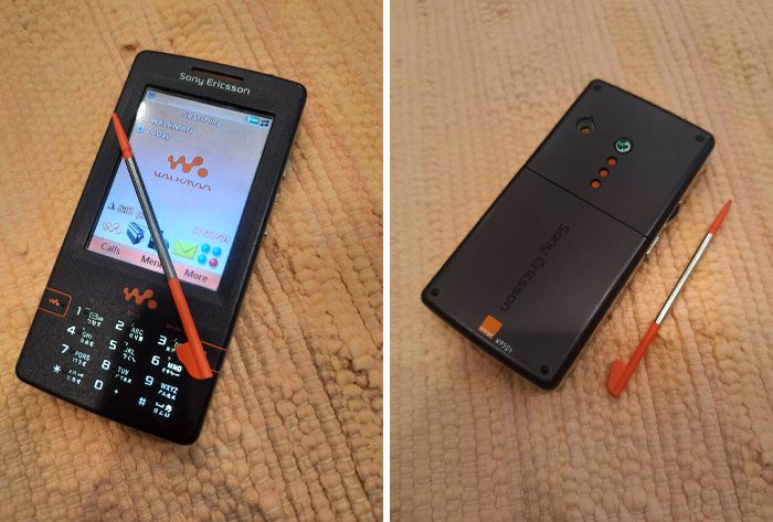
The main reason for its discontinuation was the emergence of smartphones. Full-sized touchscreens were faster and easier to control than hybrids. The Sony Ericsson W950i came to the market in 2006 and enjoyed brief success before being upstaged by smartphones.
Plus Mobile
Siemens made a masterpiece with this 2004 model, SK65. Its unique design made this phone one of the best of its time. As soon as you flipped it over, the keypad would quickly open up on the sides for easier texting. This, in turn, made the design highly compact and easy to use.
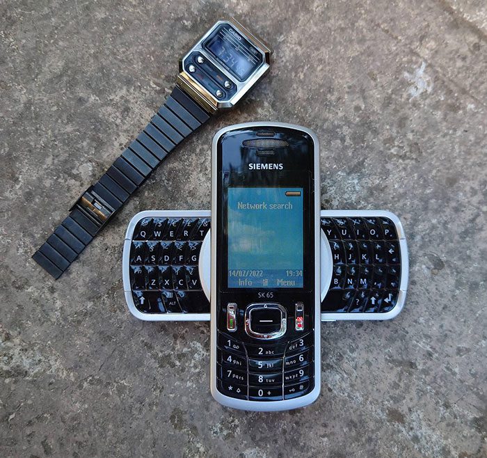
The mobile design was cool, to say the least. It was attractive and accessible for easy typing. Siemens was typically famous for making phenomenal mobile designs at the cost of bonus features, but they didn’t compromise on this one. SK65 was not only stylish but also packed with advanced functionalities.
Phone with Keyboard
Cell phones were designed for calls, not messaging. Hence, earlier design engineers tried appending old mobile phones with keypads to make texting more feasible, just like this one. Ericsson made great efforts to turn a regular mobile into a messaging cell phone, but the results weren’t desirable.
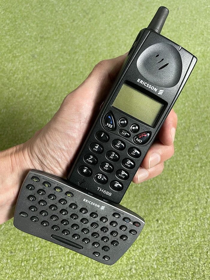
We wonder how a person carried this phone in their pocket. Even if the keypad were removable, it wouldn’t make the design any better. Carrying an external keypad and attaching it to the mobile phone whenever you need to text is more inconvenient. But who knows, maybe it was in fashion back in its day.
Samsung’s Spy Phone
Samsung SPH-N270 owners could have easily called residents of other planets and tased anyone on this one with their phone. Just kidding! But looking at this mobile phone design, what else would we think? Samsung indeed made it look like a phone from the future — a future that didn’t reach us.
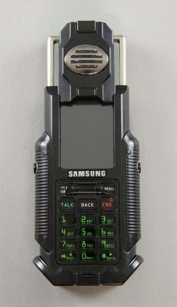
The green-colored buttons, overt speaker, and blockish design gave the design an extraterrestrial appearance. Maye ET should’ve tried to use this to “phone home.” While the mobile came with some good features, its design didn’t let it proceed any further.
Mobile Leaf
The device in the image below isn’t from some sci-fi movie; it’s a Nokia from 2003. Nokia 7600 was a cell phone designed as a spade-shaped leaf. Some might even say it looked like a kitchen alarm clock, and we can’t really blame them.
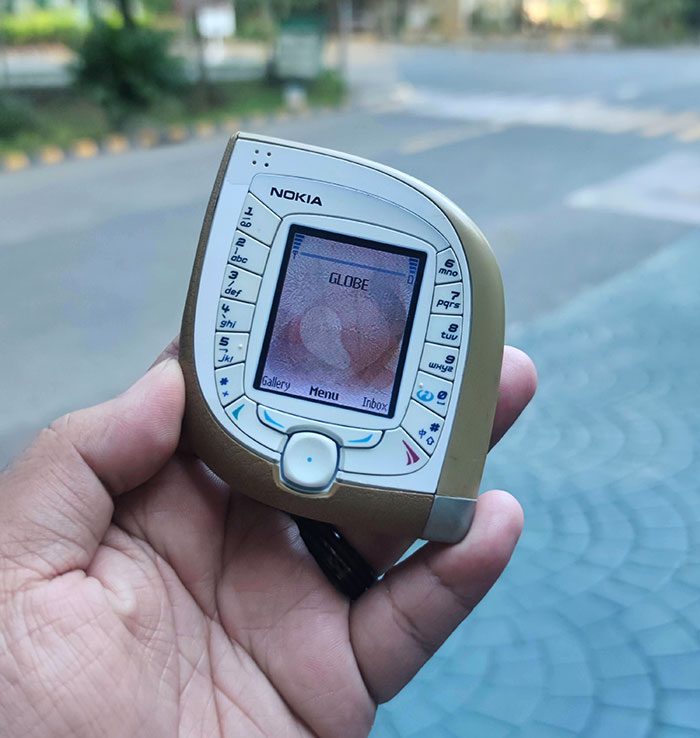
In that era, every mobile company tried to make their devices more compact. This is the result of many failed attempts to make something innovative. Nokia was always famous for its device durability, so perhaps these still exist somewhere on Earth today.
Premium Mobile
Every generation of Moto mobiles was unique in their designs, and Motorola Aura continued this legacy. With a small circular glass display of 62-carat sapphire crystal, a stainless steel body, round corner edges, a flat backlit keypad, and a 2MP camera, this mobile phone exhibits impeccable craftsmanship.
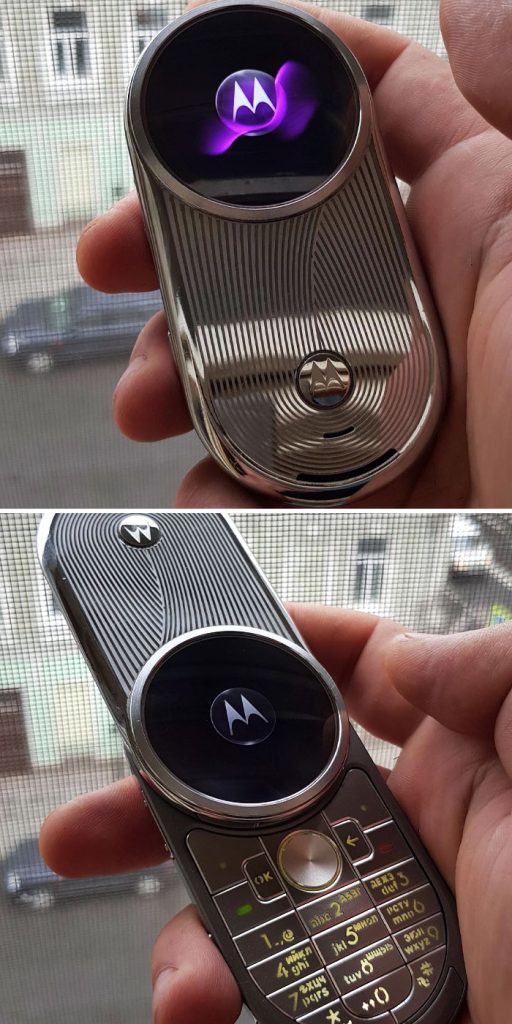
But its high price and non-user-friendly operations meant the phone didn’t last long on the market. Motorola Aura lacked the basic functionalities of a headphone jack, memory card slot, camera flash, and 3G connectivity. Also, its UI was slow, and the keypad was hard to press, making it a non-worthy choice for users.
Primitive Phone
This list would be incomplete without the mention of the first-generation phone design. Before we got some of the crazy cell phones seen on this list, we had even wackier landlines. This phone was not smaller than a bread box and seems to have been equipped with traditional school bells.
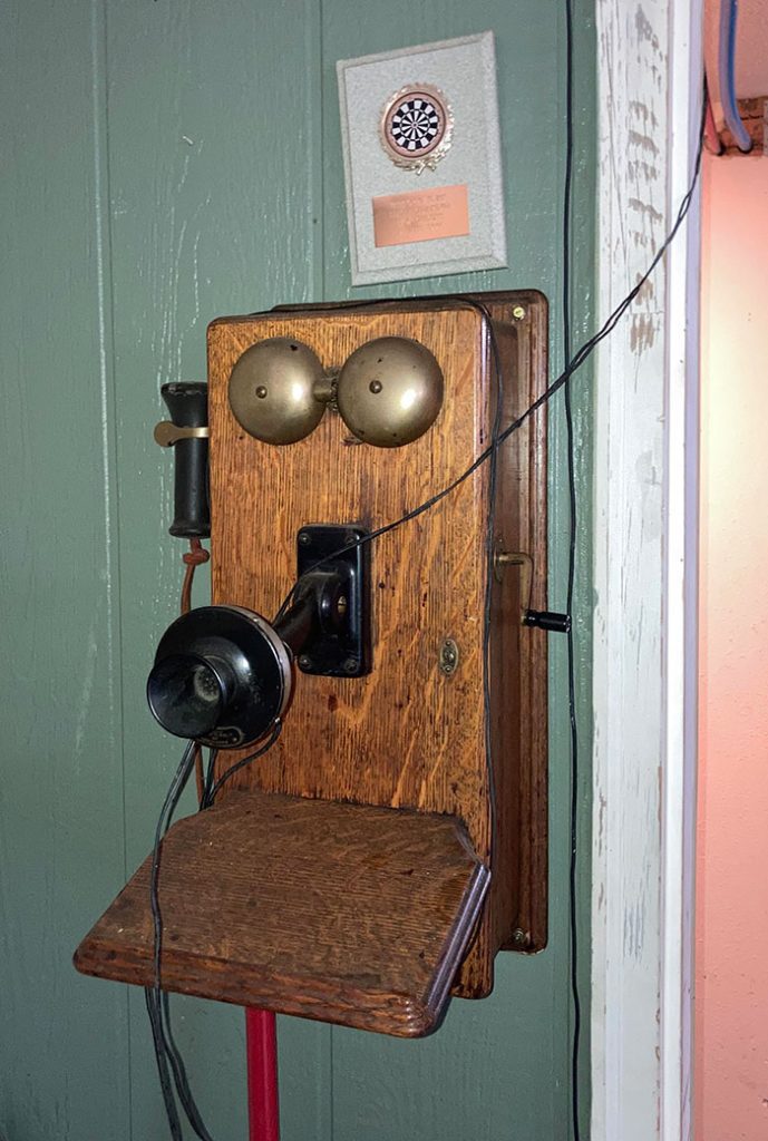
Such old phones served only one purpose, i.e., calling. Still, it took so much space and time to build one. As primitive as this technology seems to us, it’s important to remember that these phones were the building blocks for the modern telecommunication technologies we now use in our daily lives.
Duck Phone
In the early years, when home phones were new, some people preferred quirky designs for their landlines. We can’t say for certain if it was meant to be a style statement or just people having fun with their new tech, but the results were the same.
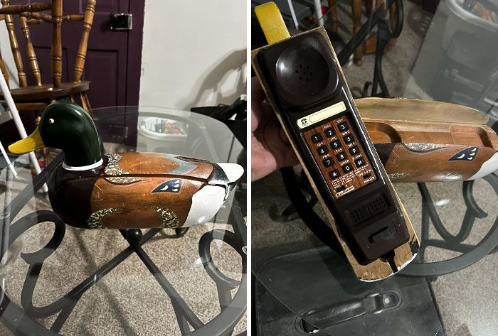
This duck phone wasn’t even common when phones like this were popular. Hats off to the designer who crafted this perfect duck camouflage. The phone not only blended well with rustic home decor but the sturdy base made it a bit more protected from kids’ roughhousing.
Nokia’s Chocolate Bar
Here comes another quirky mobile phone design from Nokia. Is it us or does the Nokia 7380 (from 2005) resemble a small chocolate bar? Jokes aside, its small rectangular screen and the rotatable controlling system added to its unique design.
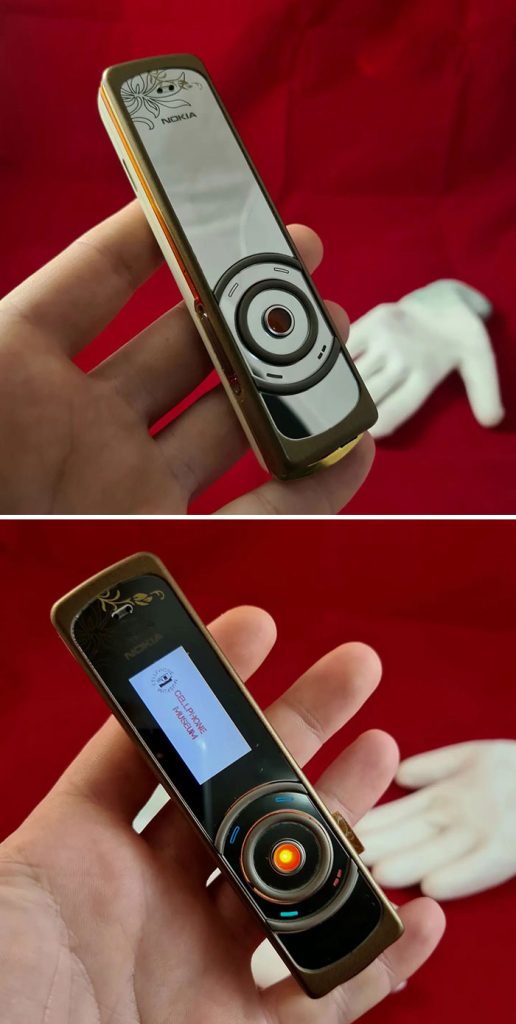
However, these particular design elements made the device’s functioning more difficult. The Nokia designer had tried to build a compact device with all advanced features like texting and an integrated music system. It worked, but the Nokia 7380’s success was short-lived.
Panasonic Carphone
Before we had phones that could fit in a pocket bag, there were car phones. For a while, these were only spotted in action movies, but eventually, some big car manufacturers like Jaguar and Ferarri took the initiative to install phones in their cars. And to tell the truth, the idea worked well.
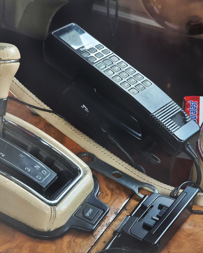
A simple design change sky-rocketed the prices of these luxury cars. People were excited to call while traveling on the road. However, with time, advanced wireless mobile phones came out to be a better solution and replaced the clunky carphone model.
First Android Prototype
Google Sooner was the first step to the advanced Android mobiles we use today. With this prototype, Google entered the mobile industry and revolutionized the entire sector. It developed a mobile that could function not only as a phone but also as a desktop.
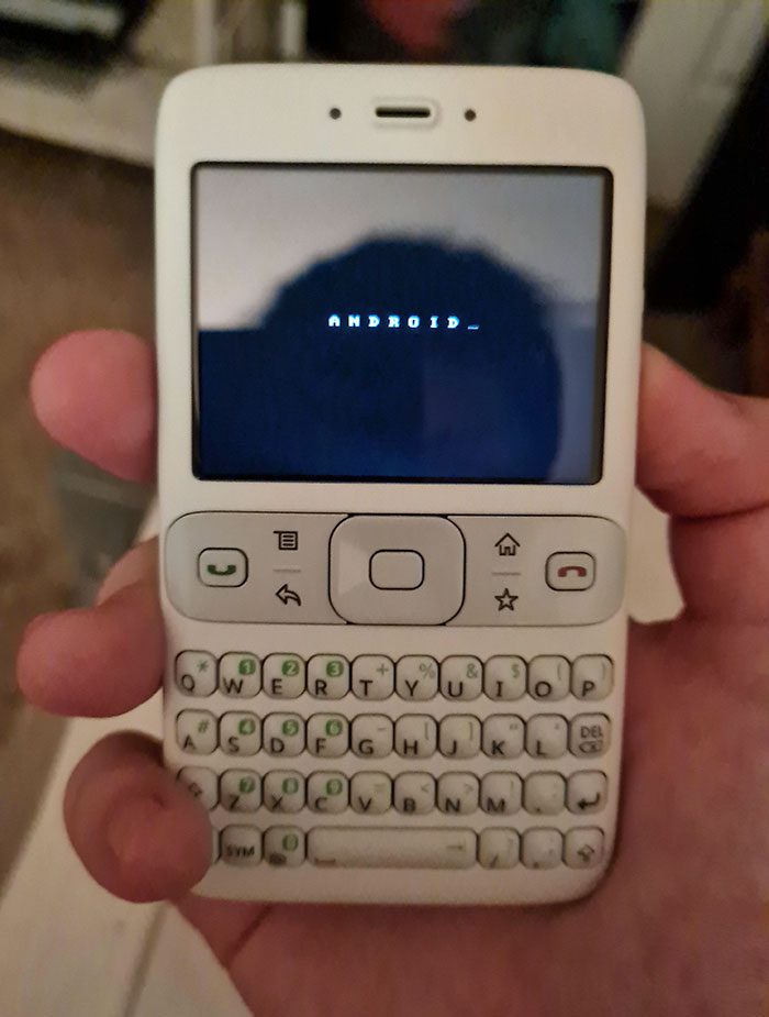
It was equipped with the basic software that facilitated internet connectivity and app installation from the web. Google Sooner had a large display and qwerty keypad, making it a perfect mobile design at that time. Soon other companies also started building similar mobiles, and the Android era began.
Flip-Up Mobile
To put it simply, Nokia 6810 was built…differently. To access the full 71-button keyboard, users would flip up the front screen. In the early days of texting, companies were trying to give users a full keyboard, and this was one such solution.
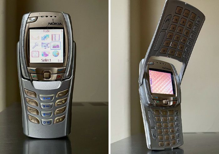
The mobile was compact, full of features, and user-friendly. Also, it was highly durable, something Nokia always had its reputation for. No doubt the designers did a great job with this phone, which helped it last for a considerable time compared to other models.
Square-Shaped Phone
Let’s start with something positive. Following the trend of flip phones is the Newgen C620. It made its debut in mid-2005. The compact design meant that users could use a relatively large screen (compared to its size), not to mention the additional small front screen.
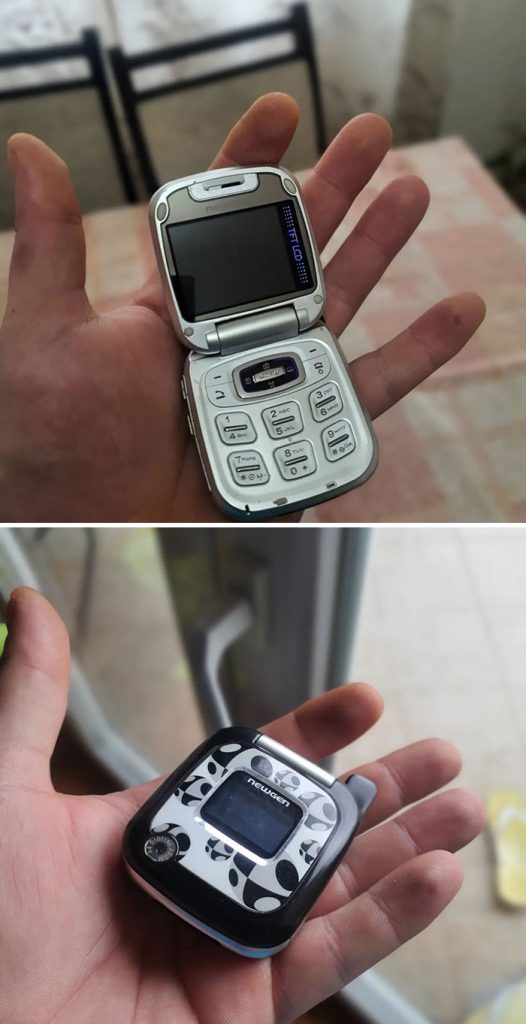
The main problem with this design is that, not only was the actual device small, but its capabilities were, too. There wasn’t even a full keypad. Due to its ultra-compact size, it was too hard to handle and type anything using only those 6 buttons.
Mirror Mobile
Due to small-sized pockets in clothing, women find it more challenging to carry mobile phones than men. Siemens strived to address this problem by introducing Xelibri 6 in 2003. The mirror on the other side gave this cell phone a unique feminine design. Also, the mobile was pink in color, adding to its womanly look.
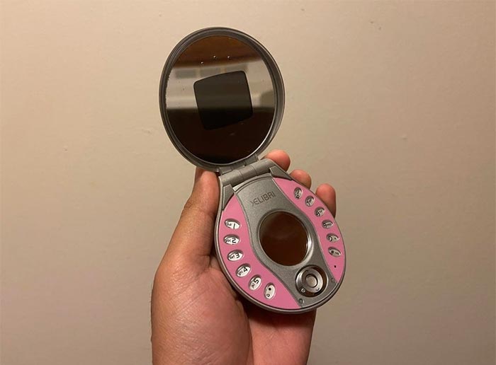
Thus, it seems that Siemens Xelibri 6 mainly targeted rich women who could carry a cute cell phone as a pocket mirror. Although the overall design was compact, the button system of the phone was complicated to control. And this design failure led to the discontinuation of this device.
Wing Mobile
Cell phones in the late 2000s were explicitly designed to provide easy messaging features to users. Sierra Wireless Voq was one of those models. The mobile company took a big step and added more than 50 buttons to this phone design.
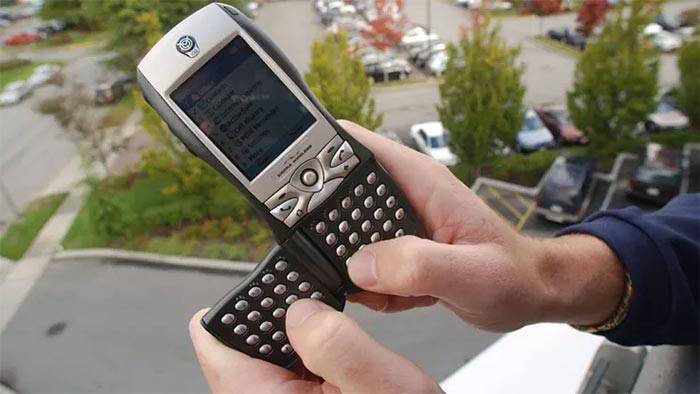
Half a set was foldable and popped out of the phone’s back. But when pressed often, the tiny buttons got easily disfigured, which became a major flaw for all keypad mobiles. What really sealed the deal was the boom in touchscreens that occurred not too long after this phone’s debut.
Evolution of Mobiles
You know that picture about the evolution of man? Well, it’s actually called “The March of Progress,” which is also a fitting name for this picture. below is a perfect display of how cell phones have evolved over the years.
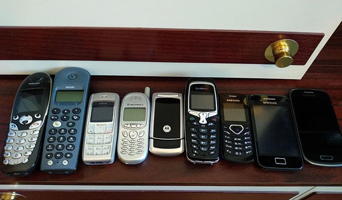
One thing of note is the (general) consistency in phone size. Sure they’ve been bigger or smaller by a few inches, but overall, the goal is to make it fit in people’s hands, so manufacturers aimed for such a size.
Video Phone
The Nokia 3650 was the first mobile phone with a video recording feature. But apart from this, the cell phone also had a unique design with a circular control system. The designers of that era were probably keen to develop phones of different shapes, rather than the usual rectangular ones.
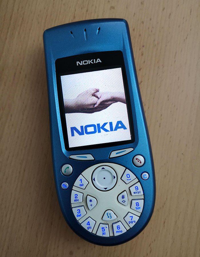
Every mobile we see today is rectangular-shaped. It seems that the “different shapes” gig didn’t work out for today’s modern cell phones. Nokia 3650 had many advanced features compared to its competitors and performed well in the market for a few years. But the design didn’t render much impact to be carried out in the future.
Facebook Mobile
This phone is the epitome of hanging on to old designs. Although it was a touchscreen, there was still one lone button. Was this to transition users into a fully touchscreen world? At least it’s no secret what the button was for, though.
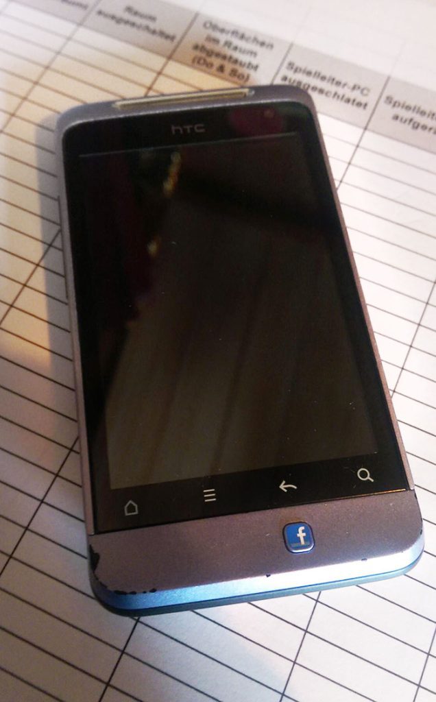
No doubt it was one of the most astonishing mobile designs of the time. Not only unique, but this phone was also user accessible. However, the alignment of the Facebook button was a significant issue. Traditional buttons usually followed a symmetrical pattern, but this button was an absolute eyesore.
Motorola “Game Boy”
No, it’s not an actual gaming device; it’s Motorola V100 launched in 2000. Motorola always came up with new designs, but in this one, they overdid it. The flip-phone design of the V100 wasn’t notable. It was the keypad that really stood out.
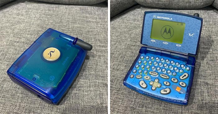
The odd layout of the keyboard was more reminiscent of a handheld gaming device than a cell phone. Though perhaps the real failing was the small screen that didn’t even take up the full top. Maybe users just bought it for the 3 built-in games it came with.
PlayStation Mobile
Nokia released its N-Gage series in 2003 with a 5-way directional controller. The mobile had a unique design with buttons all around the display. The designers ensured that it could be used with both hands, which was the prime user preference at that time.
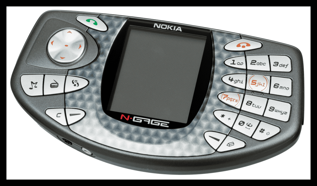
The design of this mobile phone was more like a gaming remote for PlayStation. Nevertheless, Nokia N-Gage only thrived in the market for a short time. The major drawback of the device was that it didn’t have any letter buttons — something phones of equal size featured.
Motorola Rainbow
We all know how famous Motorola was for its constant innovation in its phones. The phone in the image below is Motorola Startac. Although it looked like a kid’s toy, it was the first-ever foldable mobile phone — launched in 1996.
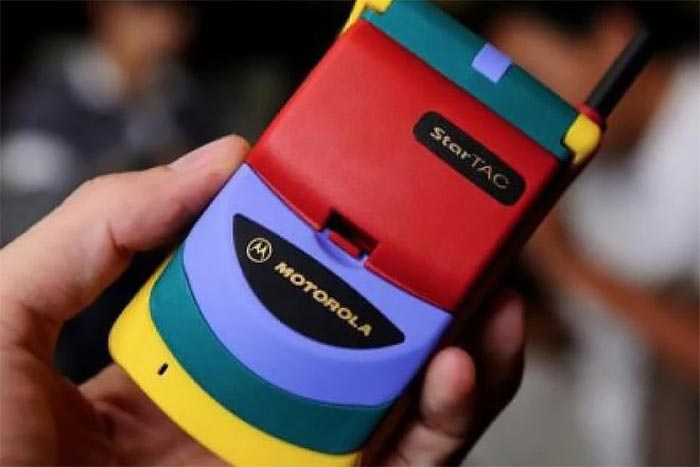
This mobile might not seem unusual as it became a trend afterward, but it was completely new in the ’90s. It was compact, lightweight, and easily portable, thus, considered one of the best cell phone models of the time. The vibrant color of the device was also something new to the industry back then.
Spider Ericsson
If you have ever wondered which mobile phone Spider-Man used, here’s your answer. It is the limited edition Ericsson T60d Spider-Man version. With the increasing craze of Spider-Man in the young audience, Ericsson flipped the board and created this giant, special edition spider-webbed mobile.
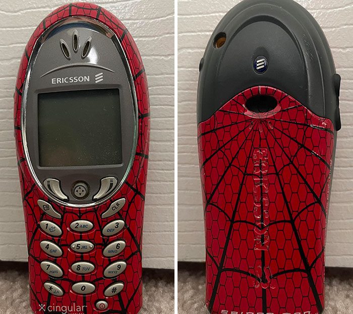
The phone’s exterior seemed just like Spider-Man’s suit. This just goes to show that superhero marketing isn’t remotely new. The next time you scoff at a Batman-themed toothbrush, just remember this phone. And no, we’re not judging if you are jealous. Honestly, so are we.
Multipurpose Moto Mobile
You can still see some of these phones in use today. It was a flip mobile phone with 2G connectivity and all other essential features. It was easy to carry, looked stylish, and was compact. To tell the truth, there weren’t any major defects in this cell phone.
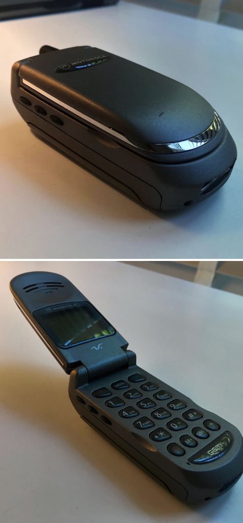
The mobile became so famous in the 2000s that even toys were made resembling this phone design. However, Motorola V50 faded with time as newer technologies began to pop up. Many still prefer this phone as a backup because of the fun of flipping it open.
Mini Laptop-Cum-Mobile Device
The Nokia E90, released in 2007, was one of the best mobile phones ever made. When closed, it looked just like any other cell phone. But open it up and you could find a mini desktop design, complete with internet access.
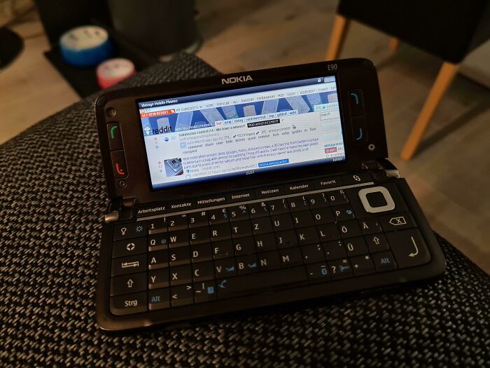
The mobile was portable, could access the internet, had numerous applications, and was integrated with a mini laptop inside; truly a marvelous piece. It’s a common saying that this mobile was explicitly made for spies and secret agents, but as the technology got old, Nokia E90 came out in the open market for all users.
LG’s Bombshell
LG made a wonder mobile in 2010, which had almost all the latest features of the time. From a sizeable 5MP camera to GSM network technology, LG KU990i came with everything. Touchscreen mobiles were new then. So, with a TFT resistive, 240 x 400 pixels touchscreen display, LG KU990i became a top favorite of mobile users.
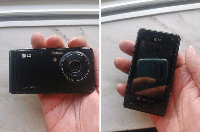
Soon this mobile phone became a representation of status among the younger kids and performed well in the market. However, the large-sized camera was its main design flaw. As mobiles evolved to have smaller cameras with time, LG KU990i became obsolete.
Toshiba 3-Circles
Toshiba designers developed this cool, lightweight design for their mobile, Toshiba G450. Rather than the usual 12-digit keypad, they separated the numbers into two sections. And, following the circular pattern, they made the screen a similar size and shape as the button “wheel.”
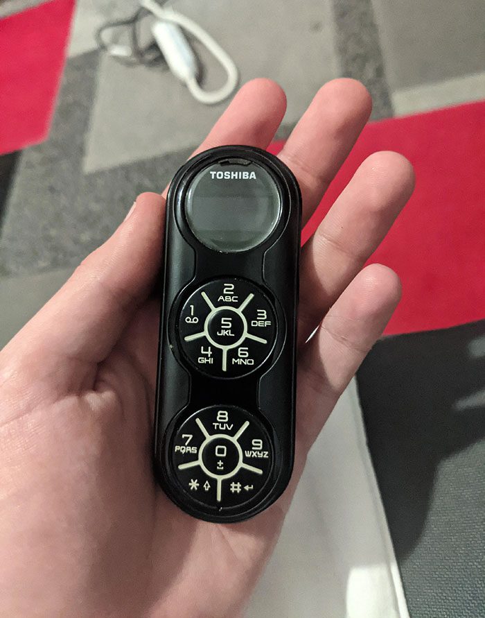
However, this phone design had more drawbacks than strengths. Due to the small-sized display, it couldn’t show a full text message at once. Plus, it had no camera, which was a major drawback. The only thing this phone had going for it was the eye-catching design.
Siemens Remote Phone
This mobile is Siemens Xelibri 8 from the early 2000s, which looked less like a phone and more like a luxurious jewelry piece. It was compact, beautiful, and classy but with no advanced features. The mobile was only good for calls and listening to the radio.
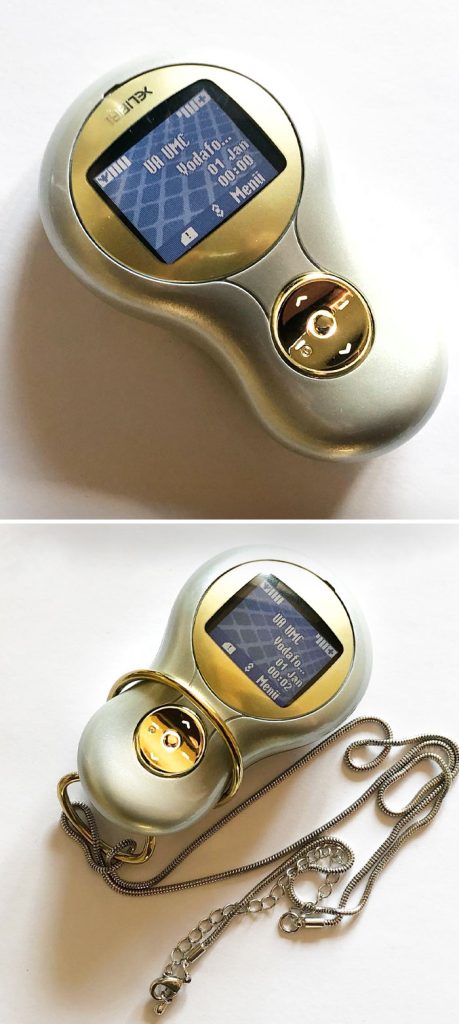
It was primarily developed keeping in mind the customers searching for something different. Unfortunately, the mobile didn’t last long, and the company stopped production within a few years. Perhaps it’s the gold-accented design, but we could see people sporting these today as a sort of hipster statement.
Cute Cell Phones
The person who took this photo (likely with a touchscreen smartphone) shared that the one on the right was the upgraded phone they got after the one on the left died. Seeing either of these next to an iPhone11 would be jarring, but this picture shows that the transitions have been taken in baby steps.
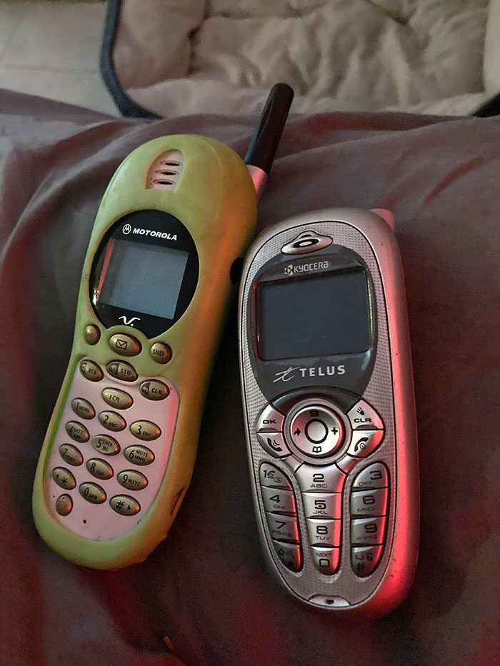
What really wow-ed the Redditor was the Telus had a color screen and built-in Tetris. The email button on the left phone seems useful…until you think about how often those buttons accidentally got pushed and you were brought to the snail-paced email function.
Walkie-Talkie
This loaner phone by Motorola was more like a kid’s walkie-talkie. No one could tell that this was a real mobile. It was given to users whose phones were held back at the Motorola service center for repair. Thus, loaner mobiles didn’t have many advanced features like regular cell phones.
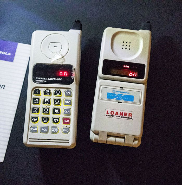
Instead, these simple, plain-looking phones came with the basic functionalities that could serve at least the purpose of calling. It seems cheap, but we would kill for something like this today. Just imagine your phone company giving you a loaner just like you’d get for your car!
Extra Large Blackberry
Blackberry was known for its incredible milestones in the mobile industry. But, at times, they also launched some poorly-designed phones. For instance, this one is too big for even one-handed messaging. The extra large display is good, but it comes at the cost of user experience.
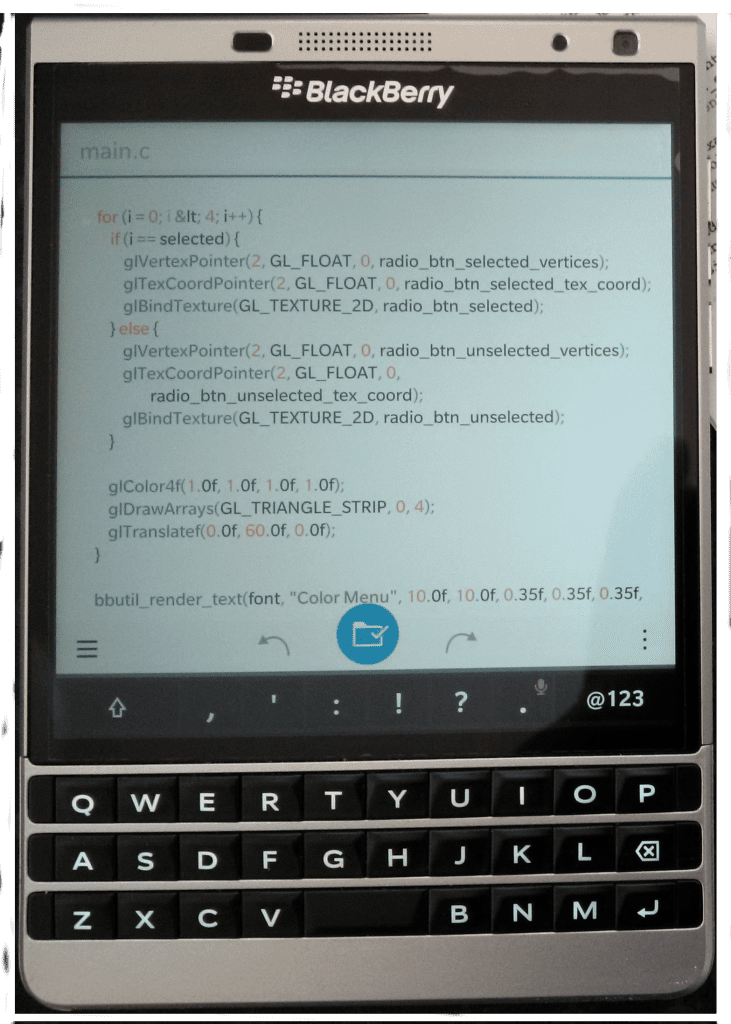
The mobile designer was highly focused on providing a larger display but didn’t give enough space to the keypad. The small buttons, in contrast to the extended width of the mobile, made it even more difficult to use. Although it looked decent, the humongous body of this Blackberry model is inexorable.
Samsung’s Telephone
Samsung Serene was the wireless replacement for traditional telephones. Its design was superb, with all buttons arranged circularly like the classic phones. Also, it had a wide display for enhanced user visibility. Thus, Samsung Serene was good for use in all settings.
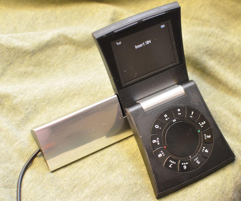
Owing to its simple design and minimal features, this mobile was perfect for the old days. It wouldn’t do today as modern phones need high-end cameras, a vast range of applications, stable internet connectivity, and more, leaving behind mobiles like Samsung Serene in the past.
Samsung’s iPod
Samsung presented a unique mobile in 2007; it was the Samsung Serenata. Like Apple, the designers of Samsung added a click wheel to this mobile, making it more fun and convenient to use. Thus, people could easily rotate the disk and scroll through content on their mobile.
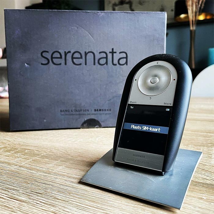
The mobile was portable with a stand at the back and contained loudspeakers. It was one of the first mobiles in which the display screen was below the controlling system. Samsung Serenata was indeed a beautiful piece of technology, but, unfortunately, it didn’t make it to the future due to high retail prices.
Motorola Lost Display
What were the designers thinking while developing this mobile? Why didn’t they give a display on the other side of the phone? It is the Motorola StarTac 6000e with one of the worst designs listed in this article. It is the first flip mobile with a display on the button side.
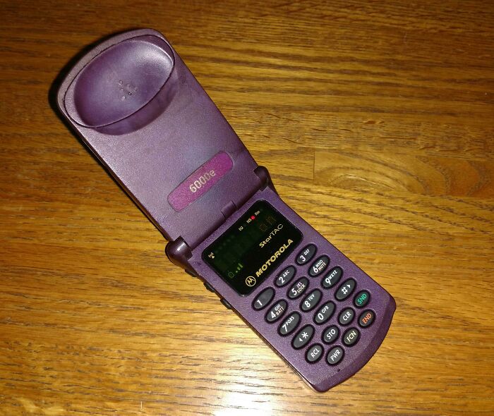
The backside of the flip was empty and was only meant for listening to calls from the speakers above. Well, the vacant space could have been easily used to adjust the display like other mobiles. Fitting a small screen on the keypad side seemed unnecessary, so this cell phone didn’t make it to the future.
Deformed Mobile
The mobile in this image is Virgin Mobile Lobster 700tv, launched in 2006. Well, the name of the device is as unique as its design. With a protrusion from the side of the display, this mobile renders an asymmetric look.
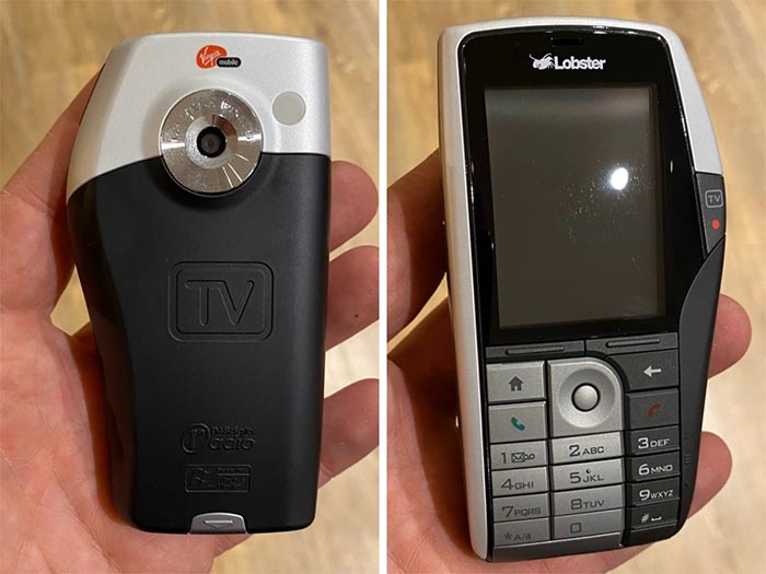
It’s worth mentioning that the designer did a great job with the color palette and the perfect display size. The black strip around the screen gave the mobile a classy and premium look. But all efforts got buried with that unsymmetrical body.
Samsung Flap Square
Samsung Gloss Sch-U440 was one of the most advanced models in foldable mobile devices. It ran with everything people loved about the Newgen C620 and added more buttons to give users a full keypad and a high-resolution camera to top it all off.
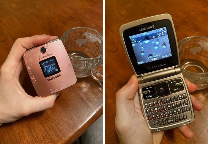
Samsung was one step ahead of other mobile companies formulating the same design phone by including a camera. It seemed impossible to fit a camera in such a compact device, but Gloss Sch-U440 achieved the design miracle and became the first choice for buyers in the 2000s.
Slide-Over Mobile
Here’s a unique phone, the Sidekick II from the late 2000s. We must credit this phone designer for curating such an outstanding design. People at that time considered Sidekick II as a symbol of being cool. The mobile hit the younger generation more and became their instant favorite.
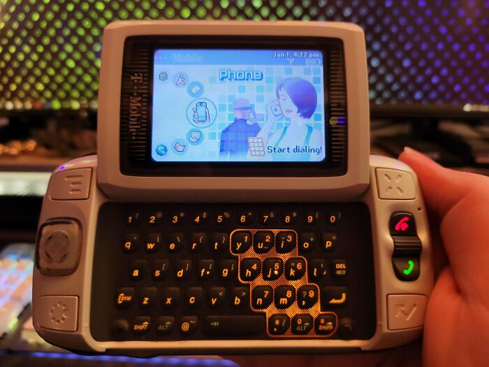
Unlike other phones with built-in keypads, the top didn’t flip open; it slid! With a smooth glide, users could transform their phone into the perfect texting device. Top it off with color graphics and it’s no wonder why younger folks liked this phone.
Motorola Spytech
Motorola never ceases to surprise when it comes to new mobile phones. This was the Motorola Flipout Mb511 that came out in 2010 and surprised everyone in the industry. It was not bigger than an iPod but still had all the latest features stuffed inside.
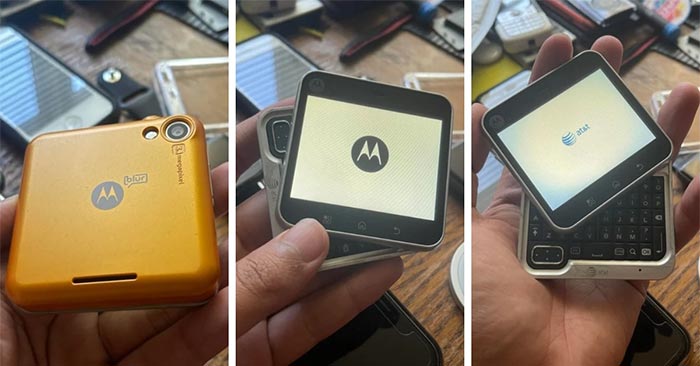
This mobile was a hybrid with both touchscreen and keypad features. It was one of the smallest cell phones ever on the market. Due to its miniature size, people even called it a spy phone. However, the cherry on top is that this mobile was a flip-over, adding a class to the device.
Telephone PC
This landline had a PC-esque screen that looked like a modern computer. The screen probably displayed all details of calls. Today’s modern landlines also have a display, but it lies inside the frame of the dial pad, not as a separate unit like this telephone.
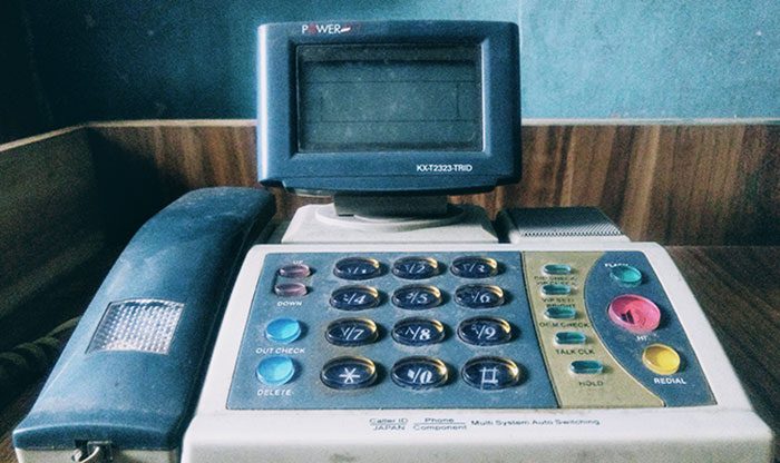
Because of its bulky design, it’s easy to mistake this device for a fax machine. Nevertheless, the design of this telephone set it apart from the rest. If it was a try to make a modern landline at that time, it was indeed a good attempt from the designer.
Weird Mobile
This mobile came with a curved base that not only looked cool but also out of the ordinary. But its keypad design is very peculiar. It had an extended display with only 6 buttons in its base. The symbols on the buttons seemed unorthodox and probably worked differently than standard mobiles.
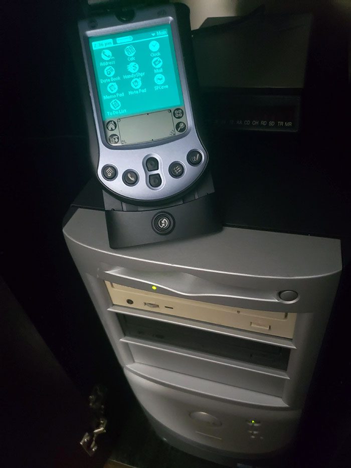
But the biggest question is, why aren’t there any numeric buttons on this mobile? A phone’s primary purpose is to call, but how could one dial without those keys? Well, these unanswered questions can at least answer another. What is the weirdest cell phone? This one!
Long-Range Mobile
How can we forget the antenna mobiles when listing long-gone mobile technologies? Here is Sch-M220, a flip-over mobile phone with a foldable antenna on the top. Due to the long antenna, this mobile served a long range with clear connection capabilities.
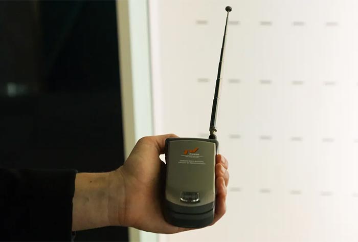
The best part is that the antenna did not cause a hindrance while carrying the mobile as it could be folded into itself. Thus, Sch-M220 was compact and easy to carry, making it a good investment. However, the device eventually got lost with the invention of high-frequency connectivity technology.
Nokia’s Calculator
Nokia looked way far ahead in the future for this device. The mobile was neither compact nor foldable, which were the trending designs of that time. Instead, Nokia built something completely different, with a screen in between and a panel of buttons on either side.
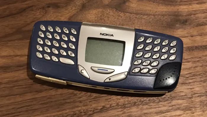
Although it looked like a scientific calculator, it was a mobile worth buying at that time. However, the company didn’t carry forward this design for long because of its large size and compact button alignments, which customers found hard to use.
Upside-Down Mobile
Believe it or not, these girls are holding the same phone. It’s the Samsung Upstage with mobile-based functionalities on either side. The two mobiles in the image correspond to the same device; just one is the front view, and the other is the backside.
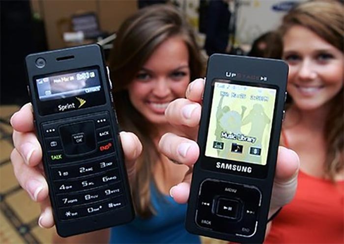
Samsung tried to maximize its phone’s capabilities, utilizing every available space. While the built-in mp3 player was a huge bonus, users were likely frustrated to find the larger screen on the side opposite the keypad. This double-faced mobile design was futuristic indeed but sadly didn’t actually make it to the future.
Fly Mini-Phone
Fly also attempted to make a compact phone like Newgen C620 and developed Fly Z300. It was a compact phone with displays both inside and outside. The main inner screen was for using the applications, while the external one displayed notifications, time, and battery life.
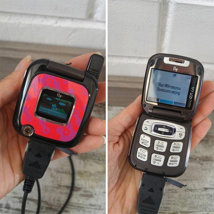
This mobile was famous for its outside display. Users could set different wallpapers to it, giving it a cool look. However, the phone was a flip-over with only 6 number buttons, adversely affecting the user experience. In addition, as it didn’t have enough space for a camera and other advanced features, this mobile design didn’t last long.
Ladybug Mobile
This is the Siemens Xelibri X4, launched in the market in 2003. The feature that set this mobile apart from the rest was its shape. It came with a unique design that closely resembled a ladybug. However, the pointy ends of the mobile being downward made it difficult to handle.
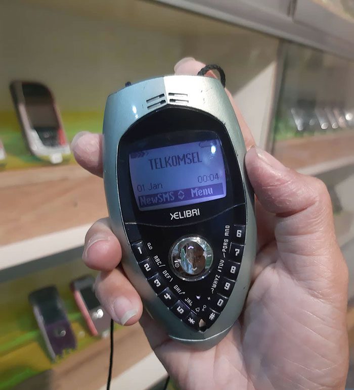
Also, the buttons were arranged in a V shape, making it even more challenging to operate the phone. Thus, it’s pretty easy to deduce why Siemens Xelibri X4 mobile design was not used for any other phone that was introduced after it.
Transparent Mobile
Sony tried something different and manufactured Xperia Pureness in 2009. It is the first transparent mobile phone. The screen was built with reflective materials to showcase the images perfectly, giving you a clear vision of the display. Now this looks like it came from some 1980s sci-fi movie.
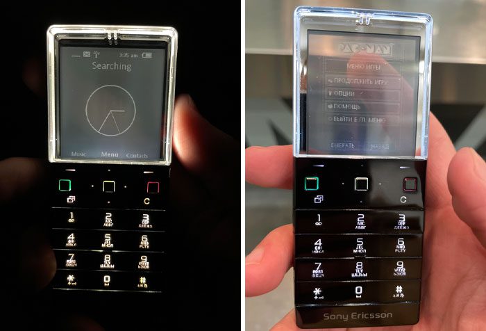
Also, this mobile was compact and full of advanced features like a music system and easy access to the internet. Although the transparent screen significantly impacted the industry, Xperia Pureness couldn’t impress the users. The poor display quality and lack of a camera due to the see-through screen were the primary reasons for the phone’s discontinuity.
